Envelope Calligraphy Style Guide
The quarantine has given me some extra time on my hands, which I have decided to work on streamlining some of my business processes. One of those projects that I have had on my “to-do” list for a while now is creating a menu of calligraphy styles for envelope addressing. Keep reading for an introduction to each style!
GENERAL TIPS
Compliment your invitations
If you have a script font on your invitations, pick a calligraphy style the compliments the existing font. There is nothing worse than an invitation with beautiful formal script typography and very casual addressing.
Ink color matters
If you are opting for ink color combinations that are less legible (metallic inks with low contrast, or white ink with low contrast), I would recommend picking a simple style with less flourishing. It will make it easier for USPS to process your invitations when you mail them!
Consider the formality
Your guests will see the outside of the envelope before they even see the invitation. Make sure that your script style matches the vision you have for your event!
THE MODERN SCRIPT

Easy-going and sophisticated casual. The diagonal baseline makes gives the calligraphy ease and provides extra space for larger lettering. The letterforms of the Modern Script are casual and simple, providing high legibility. This script is perfect for invitations with a more casual feel.
THE CLEAN SCRIPT

The clean script. Kinda modern, definitely classy. This calligraphy style features simple capital letters and a medium distance between lines on the address. The baseline (basically the invisible line that the words sit on) is straight and the zip code is spread (my personal favorite). This style is perfect for invitations that have a modern traditional feel.
THE OVAL SCRIPT
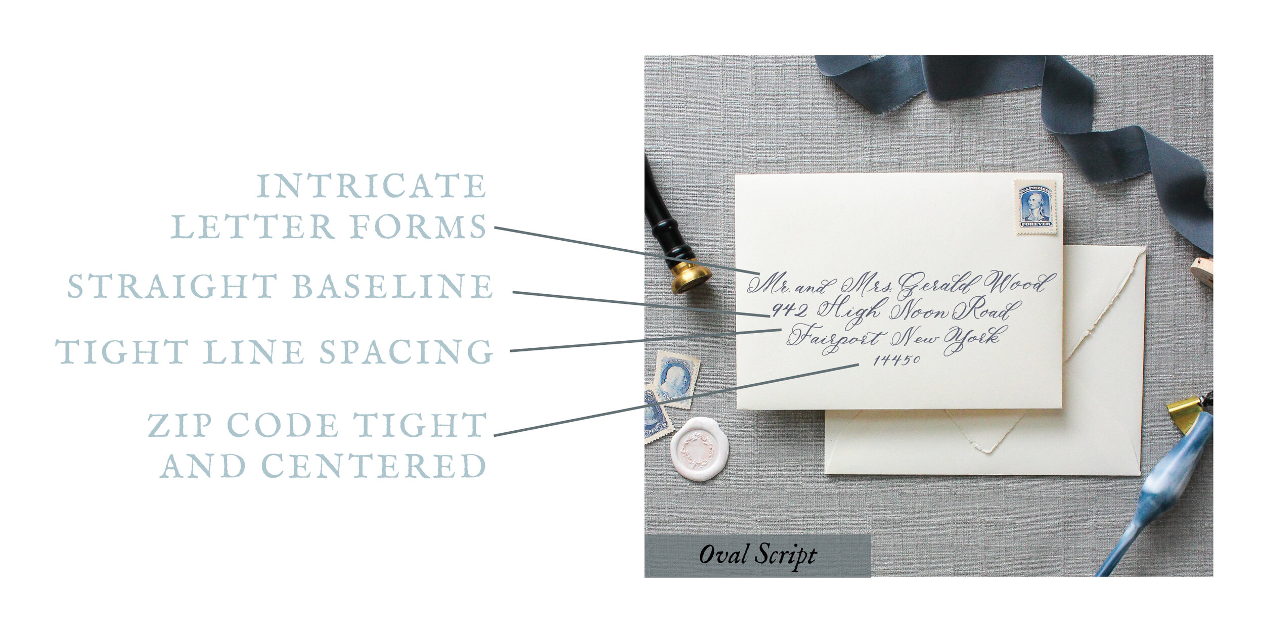
The Oval Script, a personal favorite, is a calligraphy style that features large ovals in the “entrances” of the capital letterforms. Because it is more intricate, the script gives off an elegantly formal tone without being too stuffy. The baseline is straight and the zip code is centered, which draws the eyes more towards the lettering in the address. The Oval Script goes well with creatively elegant invitations.
THE COPPERPLATE SCRIPT

The copperplate script is named for the traditional script style of the 1600s. The Copperplate Script is perfect for formal invitations because they evoke a traditional feel. The letterforms are classic, yet legible. The greater spacing between the lines is perfect for larger envelopes. The traditional, black-tie event, with inner and outer envelopes? The Copperplate Script will work beautifully.
THE SWASH SCRIPT

In calligraphy terms, swashes are known as the fancy lines around letterforms. The Swash Script is full of these delicate lines that almost give the script movement. In this style, the baseline is straight and the zip code is centered. This style is perfect for those who appreciate intricate elements and for invitations with artful details.